If this is your first visit, be sure to
check out the FAQ by clicking the
link above. You may have to register
before you can post: click the register link above to proceed. To start viewing messages,
select the forum that you want to visit from the selection below.
At what point did you / will you take the coronavirus epidemic seriously?
I hate maps/charts like that. Why can’t they just use different colors instead of shades of the same one? Loss of contrast sensitivity and color desaturation are normal age change. #oldmandrant
I hate maps/charts like that. Why can’t they just use different colors instead of shades of the same one? Loss of contrast sensitivity and color desaturation are normal age change. #oldmandrant
Sent from my iPhone using Tapatalk
Understand. This is your field. But I'm just grateful for something like this, setting expectations.
When a true genius appears, you can know him by this sign: that all the dunces are in a confederacy against him.
I hate maps/charts like that. Why can’t they just use different colors instead of shades of the same one? Loss of contrast sensitivity and color desaturation are normal age change. #oldmandrant
Sent from my iPhone using Tapatalk
Because the people making them are not cartographers.
I hate maps/charts like that. Why can’t they just use different colors instead of shades of the same one? Loss of contrast sensitivity and color desaturation are normal age change. #oldmandrant
Sent from my iPhone using Tapatalk
Actually my color vision deficiency struggles with a lot of color maps. This one's easier for me to take in.
I hate maps/charts like that. Why can’t they just use different colors instead of shades of the same one? Loss of contrast sensitivity and color desaturation are normal age change. #oldmandrant
Sent from my iPhone using Tapatalk
Visually the map would not make sense with each state set in multiple colours; using multiple values of one colour (resulting in multiple hues), the designer is able to visually convey the graduated estimated dates/thresholds by which each state can begin to ease social distancing restrictions.
Otherwise, all 50 states would have to be assigned 50 different colours which would render the map visually chaotic and make it challenging to include the legend along side the map except at a size that would significantly hamper readability.
Visually the map would not make sense with each state set in multiple colours; using multiple values of one colour (resulting in multiple hues), the designer is able to visually convey the graduated estimated dates/thresholds by which each state can begin to ease social distancing restrictions.
Otherwise, all 50 states would have to be assigned 50 different colours which would render the map visually chaotic and make it challenging to include the legend along side the map except at a size that would significantly hamper readability.
Huh? You wouldn't need 50 colors. You would need as many colors as there are shades of green on that map. I'm with AV. It would be much easier to tell between white, yellow, red, blue, and black than greenish, green, greener, greenerish, and greeniest.
Prepare to put mustard on those words, for you will soon be consuming them, along with this slice of humble pie that comes direct from the oven of shame set at gas mark “egg on your face”! -- Moss
There's three rules that I live by: never get less than twelve hours sleep; never play cards with a guy who's got the same first name as a city; and never go near a lady's got a tattoo of a dagger on her body. Now you stick to that, everything else is cream cheese. --Coach Finstock
Huh? You wouldn't need 50 colors. You would need as many colors as there are shades of green on that map. I'm with AV. It would be much easier to tell between white, yellow, red, blue, and black than greenish, green, greener, greenerish, and greeniest.
Glad I’m not alone. I didn’t respond to TB, because I thought I was missing some point he was making, and didn’t want to embarrass myself further.
Prepare to put mustard on those words, for you will soon be consuming them, along with this slice of humble pie that comes direct from the oven of shame set at gas mark “egg on your face”! -- Moss
There's three rules that I live by: never get less than twelve hours sleep; never play cards with a guy who's got the same first name as a city; and never go near a lady's got a tattoo of a dagger on her body. Now you stick to that, everything else is cream cheese. --Coach Finstock
What's easier to tell apart (especially when they're not right next to each other)?
[ATTACH]10167[/ATTACH][ATTACH]10166[/ATTACH]
Considering my state is literally the furtherest away from the legend and I’m not sure if it’s May 18 or 25, I think pink or blue would have been easier to decipher
Huh? You wouldn't need 50 colors. You would need as many colors as there are shades of green on that map. I'm with AV. It would be much easier to tell between white, yellow, red, blue, and black than greenish, green, greener, greenerish, and greeniest.
Respectfully, white is the absence of colour, and black is all of the colours mixed together. In order for white to be used effectively, you would instead have to use greys which are in fact values of black. I would not set any state in black because black is associated with death, potentially suggesting to the viewer that people in those states are going to die, and do not have any hope of social distancing restrictions being lifted.
Per your suggested legend, why do only certain states get to be set in yellow, pink and two hues of blue? Aren't all of the states in the same boat so to speak and facing the same dilemma? Or, are some states truly distinct from others, say the yellow states were better prepared than others, while the pink ones are gentler and kinder in their approach, while the blue ones were more calculated and economically conscious? Colour is more than just visual, it is psychological. Again, you are introducing complexity to the map, resulting in a larger legend that would thus require the text set in a smaller point size making it harder to read, and over all resulting in potential visual chaos.
That's my opinion. Perhaps multicolours could work. As an artist and designer, though the green wasn't a great choice (oranges or reds would have been better, potentially denoting the jeopardy or caution involved) the green version is effective.
Edit: the designer possibly chose green to denote go, a green light, or renewal.
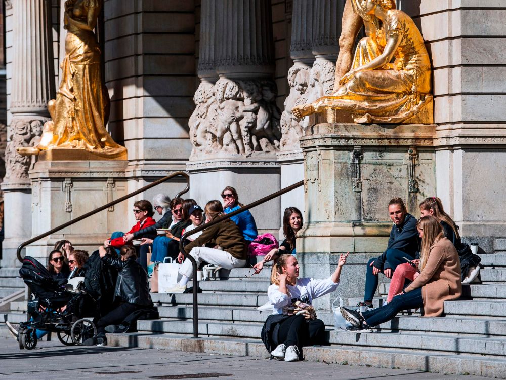
Comparing US to Sweden. We are 33 times more populated nation. If their stimulus package was 30B and ours was 2T, it means our stimulus package was twice as much, proportionately. No idea if that's an indication that their economy is doing better than ours or not. Their corona deaths so far are about 26 times less than ours, so a little bit worse in terms of proportionate effect. But this data is pretty meaningless now. We won't really be able to say which country did the best in terms of combined effort of stopping the virus and helping the economy until we have a lot more data and we've been past this a few years looking backwards.
Comparing US to Sweden. We are 33 times more populated nation. If their stimulus package was 30B and ours was 2T, it means our stimulus package was twice as much, proportionately. No idea if that's an indication that their economy is doing better than ours or not. Their corona deaths so far are about 26 times less than ours, so a little bit worse in terms of proportionate effect. But this data is pretty meaningless now. We won't really be able to say which country did the best in terms of combined effort of stopping the virus and helping the economy until we have a lot more data and we've been past this a few years looking backwards.
I have already argued these points, but for a better comparison Canada has a population of over 30 million (as compared to 10 million Swedes) and its stimulus is 24 billion.
I agree, that data is pretty meaningless now. It is time to start opening economies and go from there:
To conquer COVID-19, more people need to get sick. Here’s how governments will decide who to put in the line of fire




Comment