
Phew! Non-sequitur can sleep tonight!!
“The yellow jersey represents the spotlight designated to the greatest performers in history, a nod to the fact that Utah embraces being in the spotlight with all eyes watching."
-
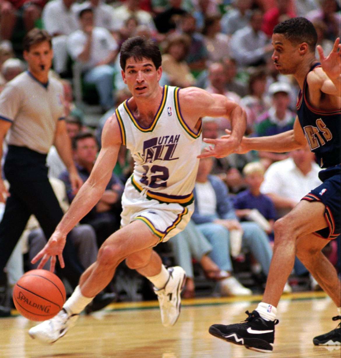
If you look at the old Stock & Malone era jerseys, purple is most prominent, followed by yellow from the Mardi Gras scheme.
I do hope / agree that the yellow would be best if it's closer to the gold / yellow from these older jerseys and less neon / Oregon yellow. But I'm also willing to be a bit patient. The yellow seems more gold on the black jersey.
One thing I'm interested in. This post was back from February...
https://twitter.com/jazznationnews/s...IN7hfB2pATwmHQ
1) Glad that the monstrosity of the Navy slanted JAZZ logo didn't happen. Just horrible.
2) I need more details around the purple and the UTAH state basketball mark. That has extreme potential.
3) The other two jerseys (white and yellow) appear to be as is.Leave a comment:
-
Yellow/gold was part of the original colors for the New Orleans Jazz. So it’s not the fact that they included yellow that’s annoying, it’s the particular shade (highlighter yellow) that misses the mark. Also, I don’t know what’s embarrassing about being the beehive state. It’s not like its the nutmeg state or the show me state.Originally posted by Non Sequitur View Post
Leave a comment:
-
Lol. Imagine self-loathing to the point that you say stuff like this.Originally posted by Non Sequitur View PostLeave a comment:
-
I wonder if yellow has anything to do with us being the beehive state. If so, it's a little embarrassing.Originally posted by Commando View PostLeave a comment:
-
I heard somewhere that they were going for a straight white and black scheme, but somebody (the NBA?) wouldn't sign off on it without an accent color, so they went w yellow. And then added the purple jersey as their official throwback.Originally posted by Donuthole View PostLeave a comment:
-
I love simple looks. These are simple, but still hideous. the massive number is too much. The highlighter marker yellow is brutal. The whites are the best of the bunch.
The purple mountain jerseys are fun from a nostalgia aspect, but too many reminders of the cartoon NBA jersey era. Sooooooo bad.Leave a comment:
-
Excellent then, because it's actually on 3 out of 4 of the uniformsOriginally posted by Donuthole View Post

The yellow color is the biggest question mark for me. If it's a bold yellow, this is a win. If it's a neon yellow I like it much less. Personally, I probably would've gone with black / white instead of black / yellow on the black jersey, but the yellow does pop off the black.Originally posted by Donuthole View PostLeave a comment:
-
They embraced it so much they left it off 3/4 of the jerseys.Originally posted by Sizzle View Post That’s my biggest gripe. Gripe #2: that particular highlighter yellow is ugly. Gripe #3: Should have gone Yellow/Navy-not black. The Pittsburgh vibes are super gross.
Leave a comment:
-
Leave a comment:
-
Also, please remember that if you don't like these that it is 100% the fault of BYU. On another note, anything that is good that happens to the Jazz happens in spite of BYU. Those are just the rules. I didn't make them up.Leave a comment:
-
You really can't think it is crazy. This is what happens with re-brands. A bunch of middle aged men get all upset when they don't go back to the classic look. It was entirely predictable that this would make people angry.Originally posted by Sizzle View Post
I actually like the clean black/white look. I don't love the yellow accent color, but could be convinced over time. I actually think this would have worked better as black/white with a purple accent.
Let's be real about the purple here that was the Jazz organization's reaction to the reaction. When the black/white/yellow got linked, people were pissed. It is not surprising that the 2022 purple uniform is just the throwback they were already using. They had no way to get a different purple jersey approved before the season. This is ultimately not a criticism of the Jazz organization. I actually think it shows insight to respond to feedback.
Looking at them more:
1) I love the white uniform. It works even with the yellow accent. That is about the only use of the yellow that I like.
2) I'm neutral on the black uniform.
3) I don't really like the yellow uniform
4) I hated the mountain uniform back in the day. I don't love it now. I do kind of like the refresh of it for 2023.
The black court is damn near perfect.Leave a comment:






Leave a comment: