Announcement

Collapse
No announcement yet.

Official Photography Thread

Collapse
X
 
  • Filter
  • Time
  • Show
Clear All
new posts

  • Originally posted by Jeff Lebowski View Post
    Whoa. Back up. What do you mean by "our lake"? And what kind of fish?
    We have a lake on one end of our farm. It's roughly 28 acres when it's full in the spring. It's deepest point is around 24 feet deep. My father-in-law built it in the late 1970s. He dammed up a creek that went through a swale on part of the farm and uses it to irrigate the farm. We have an 18" pipe coming out of it, and we can pump water into the lake from another nearby creek if natural rainfall doesn't keep it full. We can also pump water out to 6 different center-pivot irrigators to water the corn or soybeans.

    It's full of largemouth bass, crappie, bluegill, and catfish. Every year someone pulls a 7 or 8 pound bass out of the lake. It's not unusual for 2 or 3 guys to go out in a boat and fish for 2-3 hours and catch 30-40 fish (most in the 1-2 pound range). The night my daughter took the photo, the two of us were fishing by ourselves and we caught 15 bass in an hour and a half.

    About 5 years ago someone asked to put some baby spoonbill in the lake claiming they were going to come back and harvest them after they'd grown up to collect their caviar. It's never happened so we also have some giant spoonbill (3-4 feet long) in the lake. Apparently they're like whales and only eat small plant-like material in the water, so you'll never catch them on a rod and reel. You can, however, take them with a bow using a bowfishing setup with your archery rig. I've never tried it, but it's supposed to be a lot of fun.

    Comment


    • Originally posted by BYUMizzou View Post
      We have a lake on one end of our farm. It's roughly 28 acres when it's full in the spring. It's deepest point is around 24 feet deep. My father-in-law built it in the late 1970s. He dammed up a creek that went through a swale on part of the farm and uses it to irrigate the farm. We have an 18" pipe coming out of it, and we can pump water into the lake from another nearby creek if natural rainfall doesn't keep it full. We can also pump water out to 6 different center-pivot irrigators to water the corn or soybeans.

      It's full of largemouth bass, crappie, bluegill, and catfish. Every year someone pulls a 7 or 8 pound bass out of the lake. It's not unusual for 2 or 3 guys to go out in a boat and fish for 2-3 hours and catch 30-40 fish (most in the 1-2 pound range). The night my daughter took the photo, the two of us were fishing by ourselves and we caught 15 bass in an hour and a half.

      About 5 years ago someone asked to put some baby spoonbill in the lake claiming they were going to come back and harvest them after they'd grown up to collect their caviar. It's never happened so we also have some giant spoonbill (3-4 feet long) in the lake. Apparently they're like whales and only eat small plant-like material in the water, so you'll never catch them on a rod and reel. You can, however, take them with a bow using a bowfishing setup with your archery rig. I've never tried it, but it's supposed to be a lot of fun.
      Wow. Jealous.
      "There is no creature more arrogant than a self-righteous libertarian on the web, am I right? Those folks are just intolerable."
      "It's no secret that the great American pastime is no longer baseball. Now it's sanctimony." -- Guy Periwinkle, The Nix.
      "Juilliardk N I ibuprofen Hyu I U unhurt u" - creekster

      Comment


      • Originally posted by Jeff Lebowski View Post
        Wow. Jealous.
        Except for the killing part.


        JOKE! I am just JOKING.


        I, too, am jealous of the lake. Hard to imagine what that would be like as I survey my postage stamp sized Californian backyard.
        PLesa excuse the tpyos.

        Comment


        • Originally posted by swampfrog View Post
          mtnbiker, for the record, here I don't mind the tilted horizon!
          lol! Just yanking your chain. I do agree the leveled horizon looks much better.

          Comment


          • I finally did head down with a longer lens during the full moon, but should have brought the teleconverter with me (left them in the car )

            The moon is still too small, and I couldn't get a perspective where I could do anything but shoot straight up at it from on the bridge. In both images, I had to shoot one shot for the bridge and another for the moon and merge them together, the sun is really, really, really, really bright, but the moon compared to the bridge is pretty bright also.

            If I had a brain in my head, for the second shot I would have refocused on the bridge instead of just lowering the shutter speed to expose the bridge.


            Comment


            • This one just asked for some HDR Toning...

              Comment


              • Great shots swamp, especially the last extended exposure of the bridge (with HDR toning) pic. I can't really compete, but here's a shot I took yesterday:

                Last edited by tooblue; 10-16-2017, 11:44 AM.

                Comment


                • Originally posted by tooblue View Post
                  Great shots swamp, especially the last extended exposure of the bridge (with HDR toning) pic. I can't really compete, but here's a shot I took yesterday:

                  I'd be interested on your input with regard to shots like this. When the line of the edge of the road starts near the bottom, do you bring it in right in the corner? Along the bottom edge? Or along the side? I've been bringing them in right at the corner, but saw some images I really liked where they were along the side, just curious what those with art background have to say on theory on these lines leading into the picture.

                  Nice shot, I need to get out in the fall color soon.

                  Comment


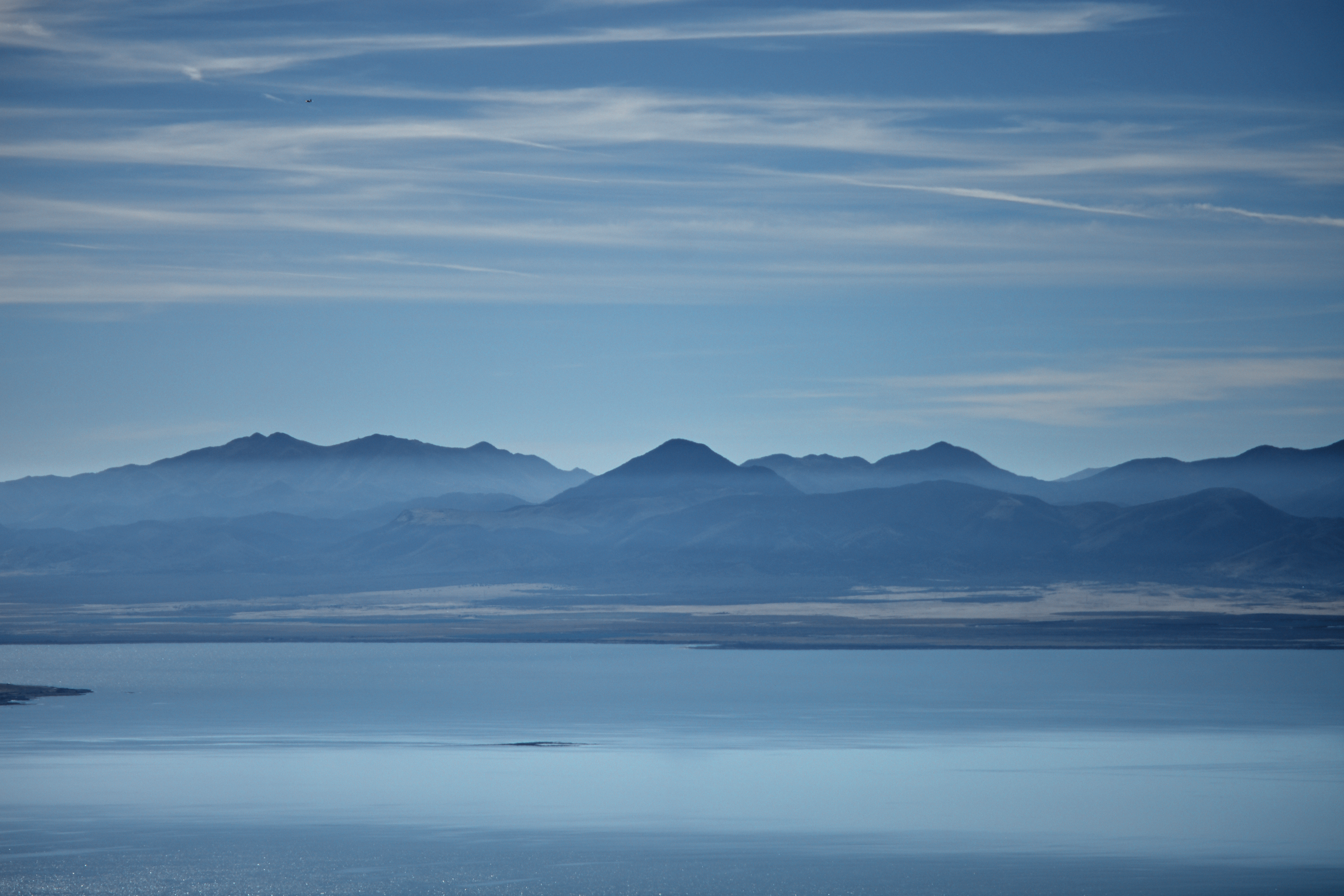
                  • DSC_3057 by copelius, on Flickr

                    Looking SSE from Squaw Peak overlook.
                    “Every player dreams of being a Yankee, and if they don’t it’s because they never got the chance.” Aroldis Chapman

                    Comment


                    • Originally posted by Copelius View Post
                      DSC_3057 by copelius, on Flickr

                      Looking SSE from Squaw Peak overlook.
                      Strong image; good detail for the distance. Do you have Photoshop or lightroom? You could really play with the blues and the browns on the far shoreline. Love that streak of white in the water. Almost feels like an abstract painting in some ways.

                      Comment


                      • Originally posted by swampfrog View Post
                        I'd be interested on your input with regard to shots like this. When the line of the edge of the road starts near the bottom, do you bring it in right in the corner? Along the bottom edge? Or along the side? I've been bringing them in right at the corner, but saw some images I really liked where they were along the side, just curious what those with art background have to say on theory on these lines leading into the picture.

                        Nice shot, I need to get out in the fall color soon.
                        You asked for it, so ... also, my union is on strike. Here's what I would've gone over in class this morning, if I weren't on the picket line. It's lot's of good info, distilled into a lecture, typically backed up by a series of in-class exercises.

                        My image of the dirt road is at the very end of the post. Before getting to it, I'll start with thoughts on lines, but in discussing lines I also have to discuss the principle of Unity, along with Focal Point & Points of Emphasis. As well, there is the issue of the rule of thirds to consider. I prefer using a thirds grid made up of unequal but equal thirds—not the common camera frame grid, but abstractly, more like the segments of, say, your forefinger. Look at it in profile; it can be measured in thirds: starting at the knuckle, the biggest segment, followed by a medium sized segment and then the smaller segment with the nail on top up to the tip.

                        My text is borrowed/edited as found in the book: "Design Basics," by David A. Lauer ...

                        Actual, Implied & Psychic Lines

                        While actual lines can serve to frame areas in a composition, the successful visual artists will first learn to recognize and in turn manipulate implied lines within his or her composition. An implied line is created by positioning a series of points so that the eye tends automatically to connect them. As well, a successful artist will also learn to readily recognize psychic lines in a composition. Psychic lines exist between intermittent points where we feel there is a line, or mental connection between the points.

                        The Principle of Unity

                        Creating a unified visual composition can be considered a primary goal for all emerging artists. Unity means that a congruity, or agreement exists among the elements in a composition; they look as though they belong together, as though some visual connection beyond mere chance has caused them to come together.

                        An important aspect of visual Unity is that the whole must be predominant over the parts; you must first see the whole pattern before you notice the individual elements. The artist’s job in creating visual Unity is made easier by the fact that the viewer is actually looking for some sort of organization, something to relate the various elements.

                        Ways to Achieve Unity

                        Proximity: An easy way to gain Unity is to simply group separate elements close together.

                        Repetition: Another way to achieve visual Unity is to repeat various elements of the design that relate to each other. The element that repeats can be almost anything—a color, a shape, a texture, a line or an angle.

                        Variety: Design implies unity, a harmonious pattern or order established among the various elements. However, it is possible to make a pattern so highly unified that the result, instead of being visual satisfaction, rather quickly becomes visual boredom.

                        In proximity and repetition there can and should be great variety. The principle of Unity in variety is an artistic ideal, prevalent in all forms of art—music, theatre, craft etc.

                        Focal Point & Points of Emphasis

                        The main enemy of an artist is apathy. You’d almost rather viewers would revile your composition than pass it quickly with a bored “how-hum.” A visual artist’s job is to stimulate the viewer and provide visual satisfaction. Nothing will guarantee success, but understanding how to create a focal point, through secondary points of emphasis will help.

                        In a composition with a theme to relate, the viewer can be shown immediately that “here is the most important element.” Secondary points of emphasis can be created to act as accents to move the eye to the main focal point. However, be careful: several points emphases of equal weight can turn a layout in to a three-ring circus in which the viewer does not know where to look first.

                        Ways to Create a Focal Point

                        Contrast: As a general rule, a focal point results when one element differs from the others. Whatever interrupts an overall feeling or pattern automatically attracts the eye.

                        Isolation: When one item is isolated or sits apart from the other elements or group, it becomes a focal point.

                        Placement: If many elements point to one item, our attention is directed there and a focal point results.

                        ---------

                        The first image below is a layout that applies all of the above design principles, but especially accentuates the idea of lines (compelling eye movement within a composition). I also typically use a lot of fine art in my discussions/lectures. Here I rely on a painting by Vermeer, before looking at my dirt road image ...

                        composition.jpg
                        composition_thirdsgrid.jpg
                        composition_lines.jpg
                        vermeerexample.jpg
                        dirtroad_composition.jpg
                        Last edited by tooblue; 10-17-2017, 09:28 AM.

                        Comment


                        • Originally posted by tooblue View Post
                          Strong image; good detail for the distance. Do you have Photoshop or lightroom? You could really play with the blues and the browns on the far shoreline. Love that streak of white in the water. Almost feels like an abstract painting in some ways.
                          Thanks for the compliments. I use Photoshop Elements because I am cheap like that. The original came out way too blue but as you can see I was able to bring out some browns through the editing.
                          “Every player dreams of being a Yankee, and if they don’t it’s because they never got the chance.” Aroldis Chapman

                          Comment


                          • Got up north again today as the temperatures were in the 60's. These pics were from our annual Scout bike hike (should've stayed longer instead of rushing home to watch the game):


                            Last edited by tooblue; 10-21-2017, 08:48 PM.

                            Comment


                            • Originally posted by tooblue View Post
                              You asked for it, so ... also, my union is on strike. Here's what I would've gone over in class this morning, if I weren't on the picket line. It's lot's of good info, distilled into a lecture, typically backed up by a series of in-class exercises.

                              My image of the dirt road is at the very end of the post. Before getting to it, I'll start with thoughts on lines, but in discussing lines I also have to discuss the principle of Unity, along with Focal Point & Points of Emphasis. As well, there is the issue of the rule of thirds to consider. I prefer using a thirds grid made up of unequal but equal thirds—not the common camera frame grid, but abstractly, more like the segments of, say, your forefinger. Look at it in profile; it can be measured in thirds: starting at the knuckle, the biggest segment, followed by a medium sized segment and then the smaller segment with the nail on top up to the tip.

                              My text is borrowed/edited as found in the book: "Design Basics," by David A. Lauer ...

                              Actual, Implied & Psychic Lines

                              While actual lines can serve to frame areas in a composition, the successful visual artists will first learn to recognize and in turn manipulate implied lines within his or her composition. An implied line is created by positioning a series of points so that the eye tends automatically to connect them. As well, a successful artist will also learn to readily recognize psychic lines in a composition. Psychic lines exist between intermittent points where we feel there is a line, or mental connection between the points.

                              The Principle of Unity

                              Creating a unified visual composition can be considered a primary goal for all emerging artists. Unity means that a congruity, or agreement exists among the elements in a composition; they look as though they belong together, as though some visual connection beyond mere chance has caused them to come together.

                              An important aspect of visual Unity is that the whole must be predominant over the parts; you must first see the whole pattern before you notice the individual elements. The artist’s job in creating visual Unity is made easier by the fact that the viewer is actually looking for some sort of organization, something to relate the various elements.

                              Ways to Achieve Unity

                              Proximity: An easy way to gain Unity is to simply group separate elements close together.

                              Repetition: Another way to achieve visual Unity is to repeat various elements of the design that relate to each other. The element that repeats can be almost anything—a color, a shape, a texture, a line or an angle.

                              Variety: Design implies unity, a harmonious pattern or order established among the various elements. However, it is possible to make a pattern so highly unified that the result, instead of being visual satisfaction, rather quickly becomes visual boredom.

                              In proximity and repetition there can and should be great variety. The principle of Unity in variety is an artistic ideal, prevalent in all forms of art—music, theatre, craft etc.

                              Focal Point & Points of Emphasis

                              The main enemy of an artist is apathy. You’d almost rather viewers would revile your composition than pass it quickly with a bored “how-hum.” A visual artist’s job is to stimulate the viewer and provide visual satisfaction. Nothing will guarantee success, but understanding how to create a focal point, through secondary points of emphasis will help.

                              In a composition with a theme to relate, the viewer can be shown immediately that “here is the most important element.” Secondary points of emphasis can be created to act as accents to move the eye to the main focal point. However, be careful: several points emphases of equal weight can turn a layout in to a three-ring circus in which the viewer does not know where to look first.

                              Ways to Create a Focal Point

                              Contrast: As a general rule, a focal point results when one element differs from the others. Whatever interrupts an overall feeling or pattern automatically attracts the eye.

                              Isolation: When one item is isolated or sits apart from the other elements or group, it becomes a focal point.

                              Placement: If many elements point to one item, our attention is directed there and a focal point results.

                              ---------

                              The first image below is a layout that applies all of the above design principles, but especially accentuates the idea of lines (compelling eye movement within a composition). I also typically use a lot of fine art in my discussions/lectures. Here I rely on a painting by Vermeer, before looking at my dirt road image ...

                              [ATTACH]8300[/ATTACH]
                              [ATTACH]8301[/ATTACH]
                              [ATTACH]8302[/ATTACH]
                              [ATTACH]8303[/ATTACH]
                              [ATTACH]8304[/ATTACH]
                              Thanks for this, it was helpful. Enrolling in some kind of art class would be interesting if I could find the time. All of the different ways compositions can be influenced could likely take a lifetime of learning.

                              Originally posted by tooblue View Post
                              Got up north again today as the temperatures were in the 60's. These pics were from our annual Scout bike hike (should've stayed longer instead of rushing home to watch the game):
                              I really like the first one, it illustrates my previous question. There are several actual lines leading into the picture, are the lines stronger if the enter the picture precisely at the corner as in the lower right? Or from the sides or bottom?

                              tree snip.jpg

                              Comment


                              • A couple more images, one from morning converted to black and white, and another from Portland at night. On the second image, I was able to edit the brightest parts of the image very easily because of the latest release of Lightroom. For those that are interested, it now includes color and luminosity masking, both of which are really, really useful to very finely control applying an adjustment over only parts of the image of a certain brightness or color.


                                Comment

                                Working...
                                X