 Tweet
Tweet
Thought about doing this for awhile. Instead of just posting in the regular thread, this one is to see what the original looks like compared to a final version. Also post processing tips, tricks, and techniques. You can click on the pictures to go to the full resolution versions.
Start it off with a morning at the Osprey nest.
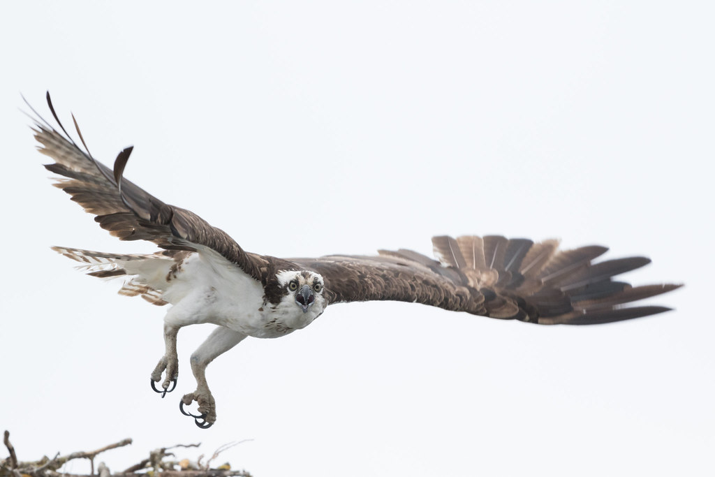
OspreyBefore
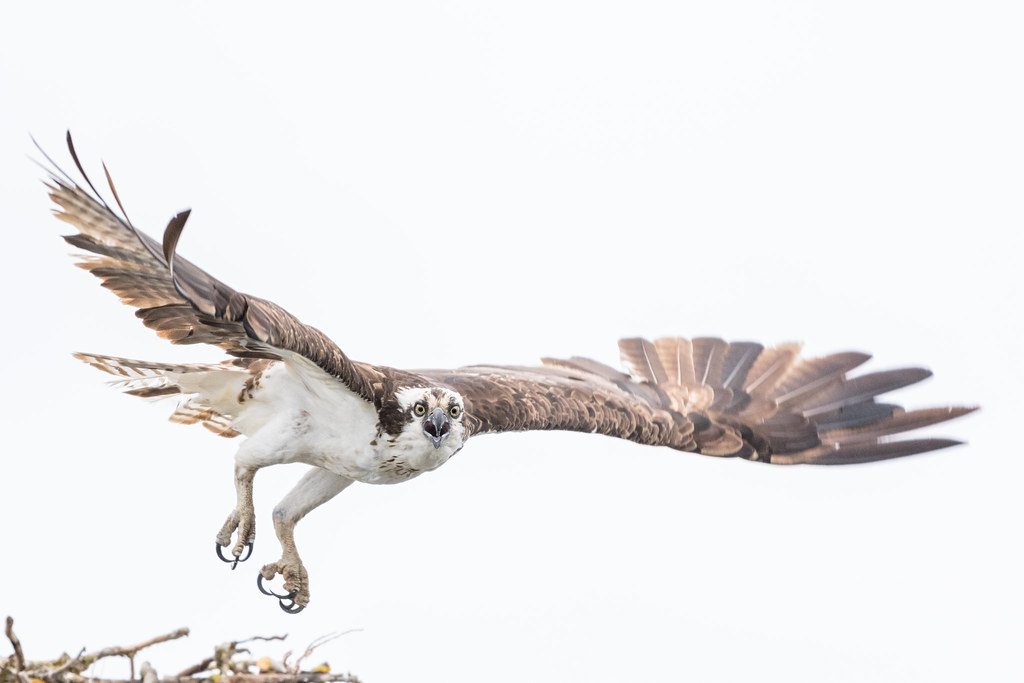
OspreyAfter
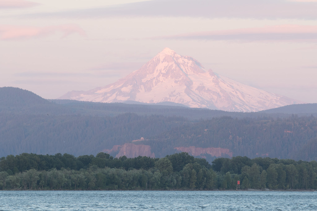
Start it off with a morning at the Osprey nest.
OspreyBefore
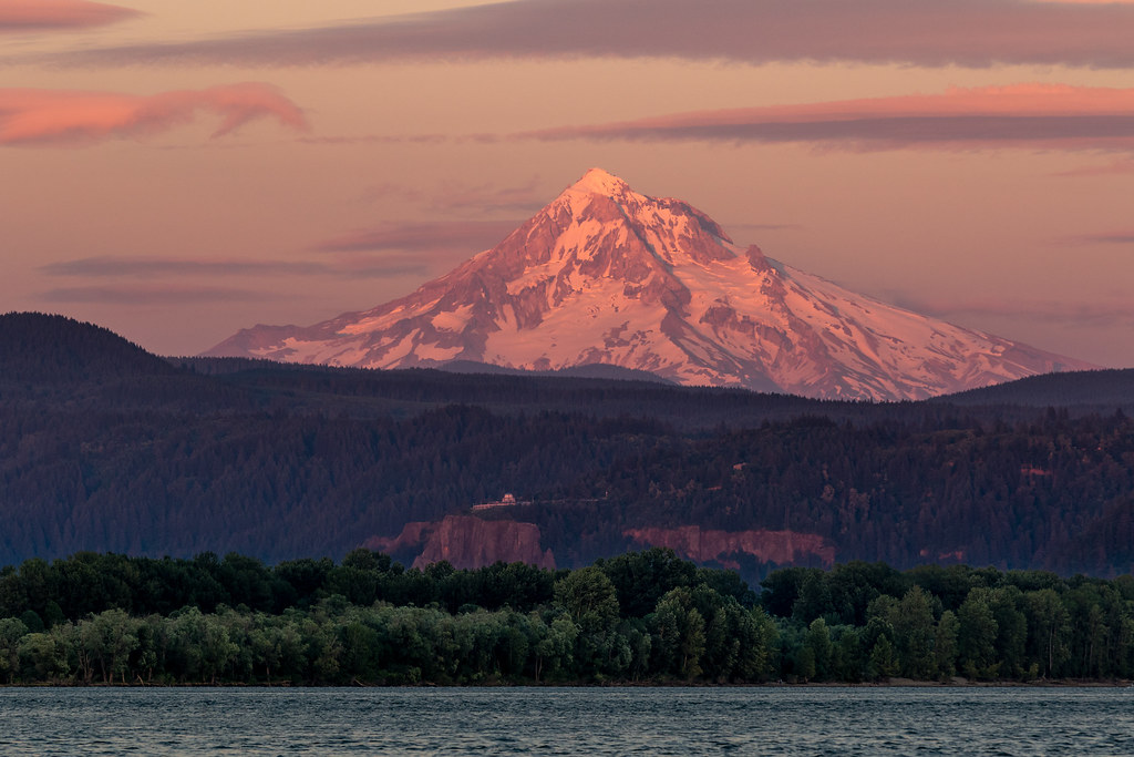
OspreyAfter


Comment