
 Tweet
Tweet
What are your top 5? We can do a separate thread for worst uniforms and link to the University of Oregon athletic page.
I based mine on a few qualities:
1. Aesthetics: Does it look like a jumbled mess or does it have a classic vibe?
2. Tradition: how closely does the uniform represent the old school?
3. Colors: are they fugly or are they appealing?
Mine, in no particular order (some may be surprised)
1. FUCLA
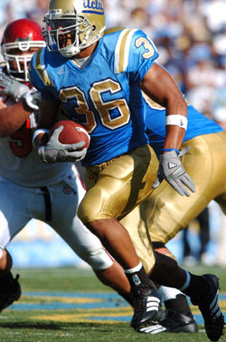
Yes, I do think they have a nice classic looking uni and the powder blue is a nice contrast to the gold. I think the shoulder stripes are a cool nod to the throwback days and the script ucla is cool.
2. Michigan
With College Football's most iconic helmet and a classic mix of maize and blue, hail to the victors of this uniform contest. And has it changed much at all since the early days of Wolverine football?

3. Oklahoma
Before Babes starts throwing out attitude, let me say that the crimson and cream combo is very striking on the field. I saw them play against SC and those uniforms really popped in person. Fortunately, so did their defensive line....rimshot.... One thing I have always liked about their uniform is the word "Sooners" across the front. That is very unique. Do any other schools pop their name across the front like that? And the helmet is plain but powerful.

4. USC
Surprise, I know. Cardinal and Gold. Classic shoulder stripes that have been worn by all the greats. The Trojan on the helmet. One of my favorites.

5. Penn State
It takes balls to wear all white when playing football. This uni seems to be polarizing. Some love it, some hate it. But everyone recognizes it. Added bonus that the entire stadium whites out, as well. Very impressive. Consider the very plain yet somehow powerful helmet and you have perhaps the most classic football uniform of all time.

Note: I wanted to put BYU's uniform on the list, but I had to penalize them somewhat per my own criteria. That Crowton-era uni switch will haunt BYU for a long while...those fugly bibs, the brown color scheme, the weird BYU logo....way too much to overcome in such a short period of time. The current iteration with the oval Y.....that would definitely be on my list if I didn't penalize them.
I based mine on a few qualities:
1. Aesthetics: Does it look like a jumbled mess or does it have a classic vibe?
2. Tradition: how closely does the uniform represent the old school?
3. Colors: are they fugly or are they appealing?
Mine, in no particular order (some may be surprised)
1. FUCLA
Yes, I do think they have a nice classic looking uni and the powder blue is a nice contrast to the gold. I think the shoulder stripes are a cool nod to the throwback days and the script ucla is cool.
2. Michigan
With College Football's most iconic helmet and a classic mix of maize and blue, hail to the victors of this uniform contest. And has it changed much at all since the early days of Wolverine football?
3. Oklahoma
Before Babes starts throwing out attitude, let me say that the crimson and cream combo is very striking on the field. I saw them play against SC and those uniforms really popped in person. Fortunately, so did their defensive line....rimshot.... One thing I have always liked about their uniform is the word "Sooners" across the front. That is very unique. Do any other schools pop their name across the front like that? And the helmet is plain but powerful.
4. USC
Surprise, I know. Cardinal and Gold. Classic shoulder stripes that have been worn by all the greats. The Trojan on the helmet. One of my favorites.
5. Penn State
It takes balls to wear all white when playing football. This uni seems to be polarizing. Some love it, some hate it. But everyone recognizes it. Added bonus that the entire stadium whites out, as well. Very impressive. Consider the very plain yet somehow powerful helmet and you have perhaps the most classic football uniform of all time.
Note: I wanted to put BYU's uniform on the list, but I had to penalize them somewhat per my own criteria. That Crowton-era uni switch will haunt BYU for a long while...those fugly bibs, the brown color scheme, the weird BYU logo....way too much to overcome in such a short period of time. The current iteration with the oval Y.....that would definitely be on my list if I didn't penalize them.






Comment